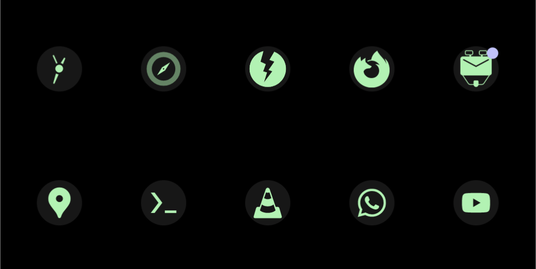
No, but Nightly has a Material You icon:

Wait, holup. The second icon has the circle as a slightly different shade of green. How did that happen?
Icons can have different brightnesses, as long as they’re monochrome
See https://developer.android.com/about/versions/13/features#themed-app-icons
Wait, where is it explicitly mentioned? I’ve done a redesign of the icon for a popular Android app. While reading the documentation, I was under the impression that whatever is on the monochrome layer would receive the same color, no matter the fill that was used.
It’s neither confirmed nor denied by the docs.
However, the docs call the icons masks, which implies that lightness values of the pixels determine the opacity of the rendered color, since that’s how masks work in photo editing softwareHere’s some further reading: https://developer.android.com/develop/ui/views/launch/icon_design_adaptive
It explicitly calls out that there shouldn’t be masks
icons should be clean edges; the layers must not have masks or background shadows around the outline of the icon.
And icons are XML files, or fancy SVGs, I was under the impression it would just pick apart the shapes and force all the fills to be the same color.
I even tried doing some fancy work with dithering, but it didn’t render

