Here are some proposed graphics.

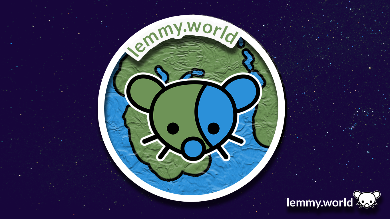



EDIT: I’ve now made a repository on GitHub, so that you can download the graphics and use them for your communities and projects. There’s even an Etsy store selling stickers now.
Here are some proposed graphics.


EDIT: I’ve now made a repository on GitHub, so that you can download the graphics and use them for your communities and projects. There’s even an Etsy store selling stickers now.
Both 1 & 2 look better on a web browser but on mobile the globe has a weird texture look to it. I like #1 as a banner and #5 for the icon. I will say I also like the current icon.