
From the other place: https://www.reddit.com/r/space/comments/1dmibwd/this_is_my_most_advance_moon_photograph_ever_it/
Pics too good to miss. :)

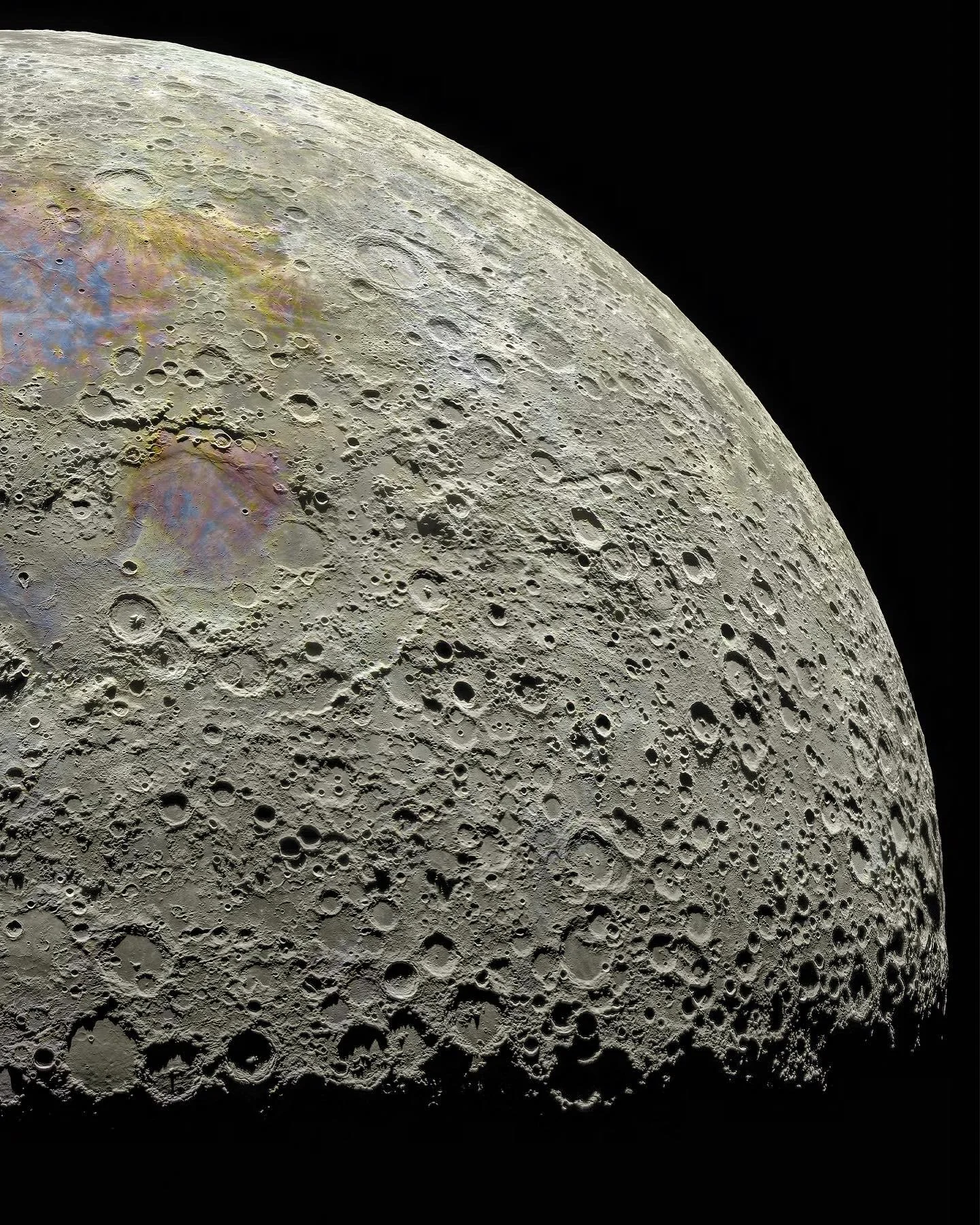
From the other place: https://www.reddit.com/r/space/comments/1dmibwd/this_is_my_most_advance_moon_photograph_ever_it/
Pics too good to miss. :)
Pasted from the Reddit thread:
Those are great explanations!
Yeah when you get into “proper” photography you quickly realize a “real” image is somewhat subjective. This moon is cracked to 1000%, though.
It’s true. I did photography as a hobby as a kid and it set me ahead when I started mapping. It’s all the same no matter the domain.
here’s what I’d like to know: would we perceive any of this pigmentation from the lunar surface?
Excellent explanation. Appreciate you sharing it!