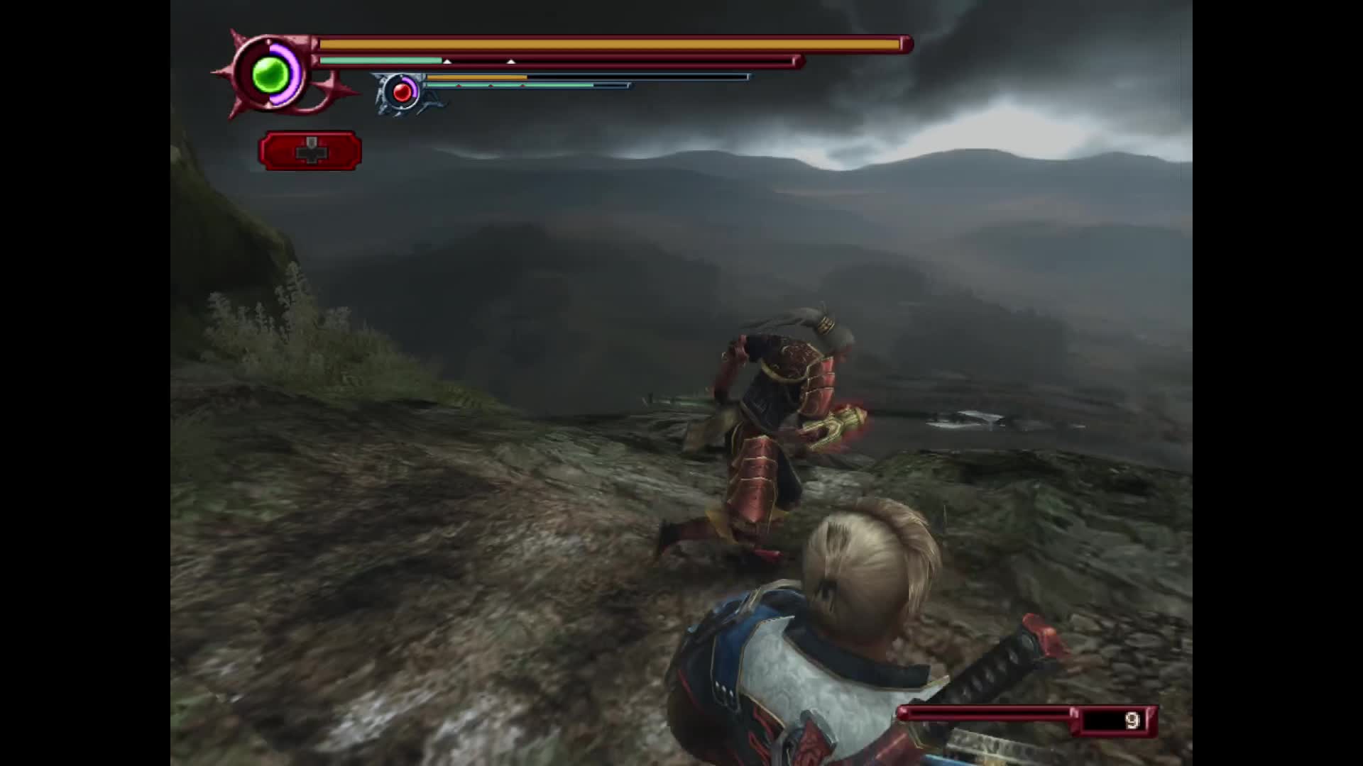
You have this level that takes place on a mountain, and the devs wanted to have a spot where you could see the gloomy landscape below with more mountains silhouetted in the distance… except this was the PS2 so it’s just two jpegs, one for the sky so you can get some parallax and a curved panoramic one for the landscape. It still looks decent enough 
This era was interesting since you could have pretty detailed character models and environments but still had to use fake backdrops and other tricks for larger environments. Makes you feel like you’re on an old movie set


They maybe could have had something modeled out but it would take more effort than it’s worth to create and then optimize. You can do quite a lot if you constrain what the player can do and see. These days I think they have so many game engine tools that it wouldn’t be as time consuming to do that. Probably even have specific tools for the specific purpose of creating low-detail 3D background environments.
One of the ending scenes in Death Stranding popped into my head, the one where Die-Hardman is crying. His face is so insanely detailed that they clearly had to zoom in on it and have nothing in the background (it’s set in a very empty hallway). It was really cool but also bizarre because nothing else in the game looked that good. And of course it had way more impact than if they had just used the standard resolution animations and models used for the other cutscenes. That’s basically the inverse of what your clip shows.
I also love your clip at the end where it cuts to the other character looking like they’re repeatedly stabbing themself with a sound effect.
Also agree about the movie set thing. Even new video games still feel like that. Even more so than movies.
I guess they would have had real constraints on how many polygons they could have had on the screen on the PS2
He’s supposed to be impatiently bouncing his giant sword on his shoulder while idle