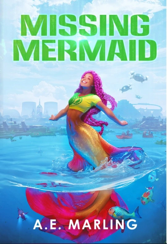
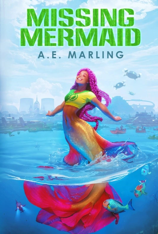
I’m swimming-with-mermaids delighted to reveal the cover of my next solarpunk mystery novel, Missing Mermaid. Right now I’m deciding how best to arrange the text on the cover. Do you recommend option one (author name on her tail) or option two (author name and title both up in the sky)?
The illustration is by Nell Fallcard. You can order the ebook, internationally, on the indie site Smashwords after its release on May 24th. You can preorder the book on Amazon. The paperback will come later on Barnes and Noble.
I like them both up top. It makes the image pop more & looks more traditionally bookish to me.
I think splitting makes the most sense for covers that have a series title up top by the book title.
I do think they both look good & it doesn’t make too much of a difference.
Good luck with you book launch :) I know it can be a tough market for new/indie writers
Thanks!
The market is horrible, but what I care more about is spreading solarpunk ideas in a fun way. 💚
That’s a great mindset to have. I write as well & it’s for the love of craft, definetly not the paycheck lol
Stories are just so fun to tell, I’m looking forward to reading yours :)