

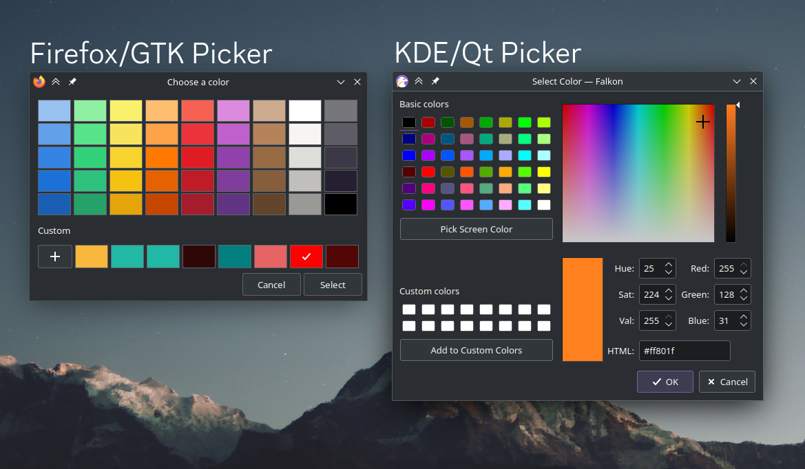
I use KDE Plasma, and much prefer the KDE color picker over the GTK one that Firefox uses, with input type=color.
I know that I can set GTK_USE_PORTAL=1 to make Firefox use the native file picker, is there a way to make it use the native color picker as well?
I know there probably isn’t a way, but I figured it’s worth a shot asking.
How do you plan to deal with translations? Cause not every descriptive word is translatable, some languages have words to refer to two shades, while another has only one word and both shades are culturally perceived as a single shade.
Honestly I don’t know exactly how I would deal with that in the long run. I really appreciate you for asking though.
I’ve done research into this very topic, and have learned that some languages do not include a word for ‘pink’, but rather a descriptive form for ‘light red’. I’m sure there are numerous other examples of translation issues.
Unfortunately I am not a multilingual programmer, so honestly I would need some help trying to make it work ideally with other languages.
I do thank you for asking this very question, as it indeed is a complication I would need help with… ☹️
You are being rather ambiguous with how your program works, which I understand. But if the primary way of selecting colors is through words then that is big issue that I feel can’t be made to work outside of English.
If the selection is more “traditional”, like a color wheel or whatnot, and the text is just a description (I think coolors does this) then it might be translatable.
Like, the issue with “pink” being “light red” is that you can’t actually select pink and a lighter shade of red if the selection is through text. If the selection isn’t text based then you can just have two colors being “light red” cause it is true anyway
Text works to select or mix a color (I have a totally different definition of ‘color’ in my system). One ‘color’ is an entire measured gradient of colors.
I use terms like ‘solid color’ and ‘faded color’. Every other system uses solid color technology, but I use faded color technology in combination with solid colors.
Look underneath you, look at the shadow on your floor/carpet. Does that shadow change the color, or does that shadow change the illumination of the same color?
What is a color?
Isn’t that just a semitransparent layer on top?
My original inspiration for my color processing system was to fix images with a ‘color cast’, if you will. Like, if an image has an extreme blue hue because of a camera flash, or something similar.
The more I researched into it and experimented for myself, the more I realized that chromatic offset isn’t much different than the C in Y=MX+C. Find the offset and subtract it from the image…
To me it was basically like a fog, that needed a mathematical solution.
Nope, existing color systems can’t account for color flare, which is nonlinear.
I really do appreciate your questions and comments, and it boggles my mind to try to explain it in a sensible way…
The color wheel may as well only be useful for scientists, who are trying to measure the spectrum of light coming in. Awesome! 👍
But that’s not intuitive for artists and painters and the like. The rainbow color wheel, as scientific as it may be, does not represent how artists actually see the world.
Sure we see the world with colors, but we primarily see the world with brightness levels. If you see a face, you’re not gonna see much of a change in hue, you’re gonna see variations in brightness of the same hue.
TL;DR - Color is more than what Crayola created, it’s not a solid, it’s a faded fluid. And there’s a math to it…
I’m not exactly sure if I follow. Like, isn’t brightness already slider when using HSV? Meaning you can just change the brightness without changing Hue or Saturation.
Edit: HSL, not HSV
You have asked all the proper questions for me to have full respect for you and offer a link of my prototype…
https://drive.google.com/drive/folders/1ibb3GnYb_LFqfk-HxlMtfyT8j5Fi2Hjq
Please take note that my software may have glitches, which should be outlined in the readme. I admit it’s incomplete, but it’s not easy designing a whole new GUI concept on your own…
Sadly I am away from a computer for quite a while so I can’t truly test it, but the first picture shows a nice concept of Brightness X Hue between two colors.
I can’t say I’m an artist, but I did design the current icon of a semi famous Android app, and I was actually using numbers to pick the correct values, as I wished the colors had a somewhat understandable mathematical relationship between each other
That was their goal yes, but it doesn’t work correctly. Of course that depends on display technology, in some cases it might work perfectly.
Still, those technologies work with numbers. Tell me of one Picasso out there that can actually paint with some calculated numbers? Not a damn one, they paint by using their eyes and hands.
So how do you mingle the analog technology of the human eye with the digital technology of a computer? Answer is, you don’t, unless you can design an intuitive interface for humans that they can just look at and communicate with, rather than look a bunch of stupid numbers which almost make no sense.
HSL vs HSV?
Part of my prototype was gonna be called HSG, (Hue, Saturation, Greyscale), until I fully realized true artists don’t work with numbers at all, they work with their eyes and hands.