- cross-posted to:
- android@lemdro.id
- cross-posted to:
- android@lemdro.id
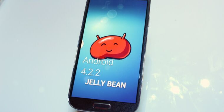
Lock screen widgets were a neat idea but the original implementation was ugly as hell.
Just let me put read-only widgets on the lock screen.
Am I missing something or is this article weird? I have Android 14, one UI 6, and lock screen widgets.
That’s because of ONE UI, they’re not part of vanilla Android.
Kinda figured that after I hit send. Hazzard of being old.
I didn’t know there was such a thing for some UI… AOSP should catch up quickly if you ask me… I upgraded to A14 and all I have found so far are lags and stutters, especially when minimizing apps… I hope it is only because “it is too fresh”.
Who needs this? Fix this first
- unusable music player buttons, way too small and weird
- quick settings way too big and ugly, things missing
- implement most GrapheneOS features, like Contact and storage scopes, internet permission, etc.
- stop disabling permissions of apps opt-out. Its a feature for dumb people
- keep maintaining the AOSP apps instead of the Google crap…
I agree with you about fixing the UI of things that appear on the lock screen that we already have, but I also remember and used these widgets back in the day and I have a use case for them.
Would be nice for more than just small and adaptive for the basic clock. Maybe add medium and large back in? (just something I don’t understand about vanilla android)
Could we get rid of the lock screen altogether? That would be super.


