- cross-posted to:
- france@lemmy.world
- bean@lemmy.world
- cross-posted to:
- france@lemmy.world
- bean@lemmy.world
Hey 👋 I’ve been working on a new Lemmy client called Bean for the last few weeks and I’ve put out an early beta.
It’s missing some features at the moment but I’m working to get it feature complete by early next week and would appreciate some feedback as I develop!
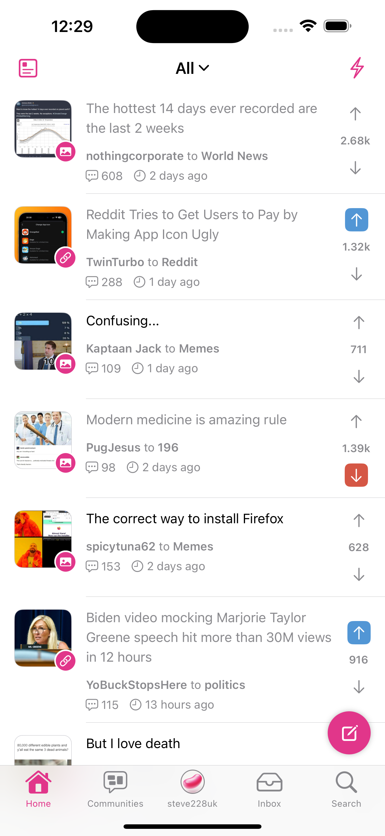
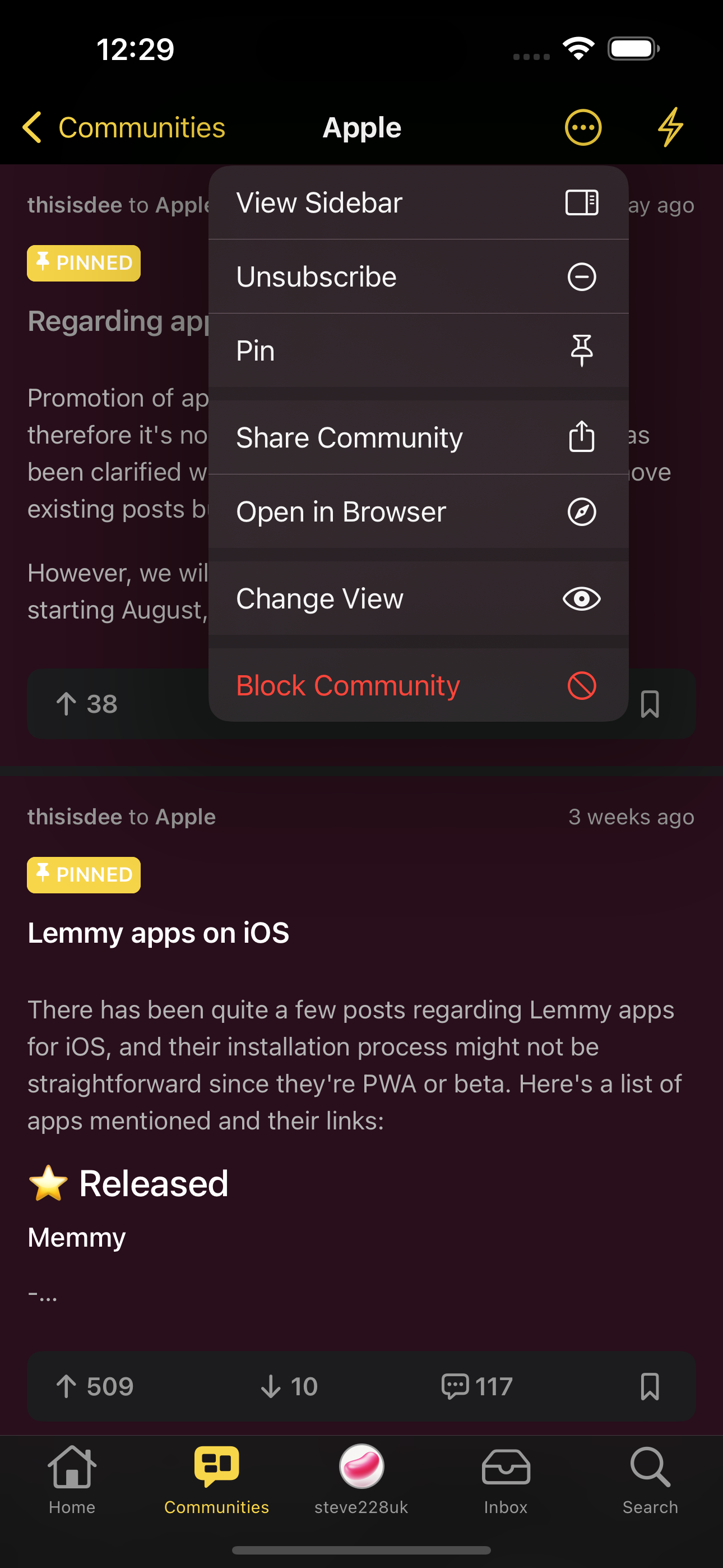
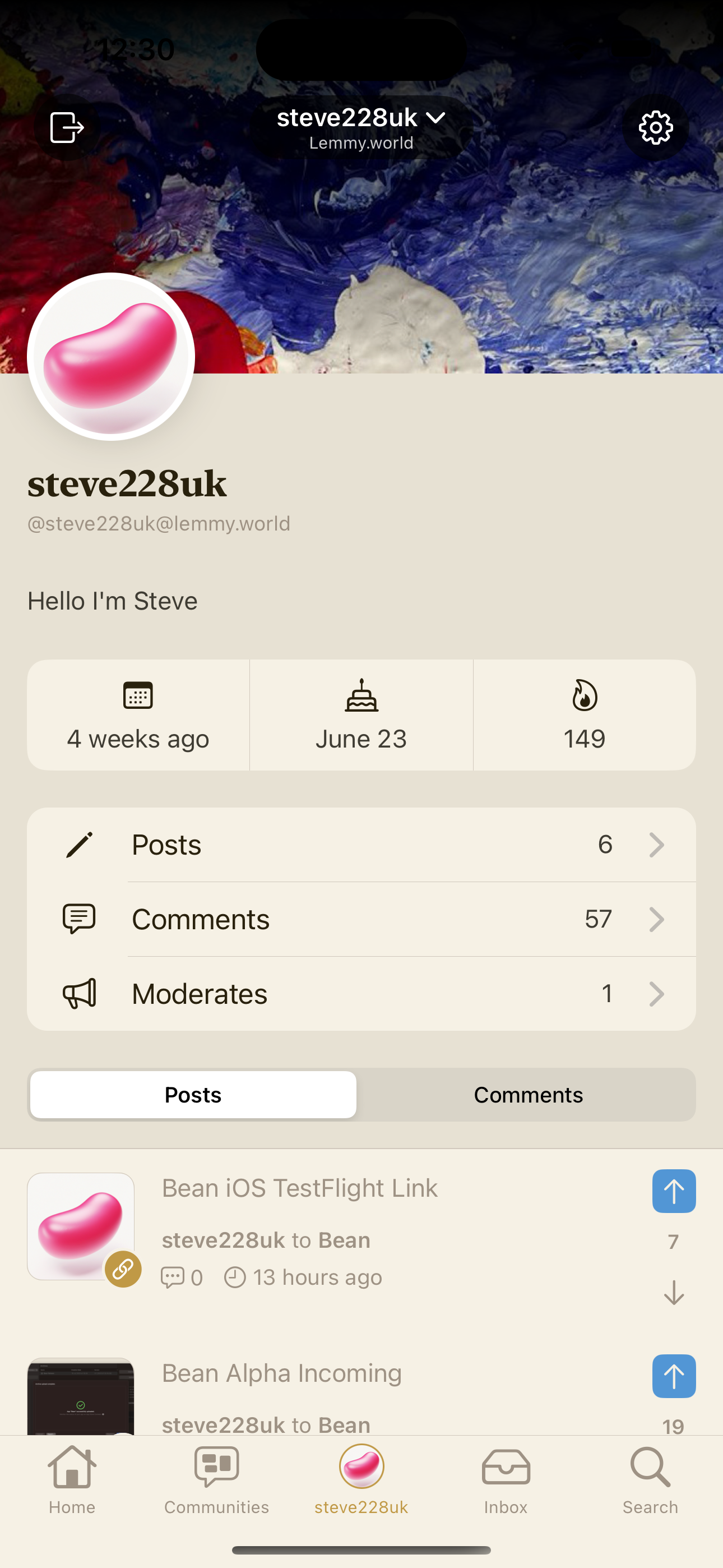
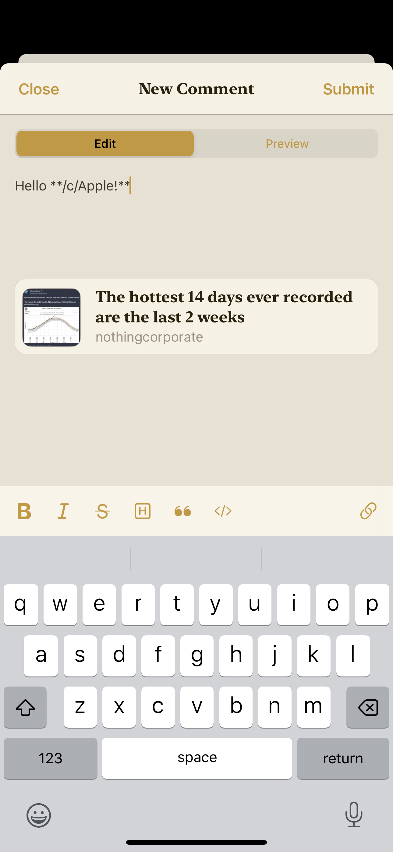
You can find out more over at !bean@lemmy.world but here are a few screenshots.
Let me know what you think if you do check it out.


My god that icon is beautiful haha
Thanks so much! There’s a few variants in the settings 😄
Nice dab at the official app!
What did you use to make the icon?
It might seem old school, but it was made in Photoshop


Hey Steve. I’ve got a question. If I click on those screenshots the comment gets collapsed instead the screenshot going full screen. Are you aware of it and are you planing to implement full screen pictures in comments in the future?
This should be fixed in the next build. It was a regression bug due to the implementation of the collapsible comments.
You‘re faster then light buddy. Thanks a lot. I really love your app. As soon as everything is working properly I can uninstall every other Lemmy app.
Oh nice. I always make very 2D icons in Figma, but for macOS I try and make them more 3D. Not found an amazing way to do that. Is the bean shape a bunch of layer effects over a shape, or are you using an image from elsewhere and using blend modes?
It’s a flat shape with a gradient, then I went over it with the brush to add highlights and shadows with a mix of blend modes like overlay and hard mix
I tried it. The interface is fast and clean and looks like native iOS app.
I just can’t seem to upvote or downvote comments.
However despite that, your app is one to watch out for. Congrats and keep up the good work!
That’ll be coming in the next day or two!
Now that is fast! I can’t wait to see what you will do to the app.
This looks great, so polished already!
There’s one thing missing that I’ve noticed a lot of Lemmy clients are missing that I used extensively in reddit clients, and that’s the button to skip to the next level comment. It makes long comment threads much nicer to read. Any chance we could get that added?
A couple of people have mentioned this today so I’ve added it to my list 😊
Please add one more vote from me for this feature. I miss how it was implemented in Apollo.
FYI, your willingness to add it to your list has me signed up for TestFlight now. I look forward to seeing updates on this, thus far, excellent work.
You rock, thanks!
Looks incredible! I’m on Android but just wanted to say how nice your app looks. Great work (and amazing app name, hahah)
Thanks so much, I really appreciate it 😄
Nice, time to flick the bean.
I’ll give it a good flick.
Damn I’m late for my own joke
Just DL the TestFlight. Gorgeous app, feels very slick and native feeling. Will continue to test and give feedback as it matures.
Thank you! 😄
So I’m basically running all the current iOS apps and up until now Memmy has been the smoothest, until I tried Bean, I don’t know what you’ve done but there is absolutely zero scroll lag, which is the most important part of any app for me, looks great too
Downloaded and like every app I go looking for the option to increase the font size. Sadly like most Lemmy apps this seems to not be high on the list for early releases . Can’t test it if I can barley see the text in the post and comments without squinting.
Hopefully it is high on the list of things to add. Until them it is still Memmy for me.
Memmy. Memmy is basically what I feel the most put together 3rd party app out there. It’s what I use and it’s on the App Store.
Heads up, a build with the font size slider is rolling out to TestFlight now!
If you didn’t know, you can actually increase font size for any iPhone app individually. If you go to Settings > Control Centre and add Text Size, you can change it per app.
I did know but actually forgot about that. I already had the text size in my control center. Regardless I will stick with apps that give me that option in the app itself. Memmy and voyager have it and are my gotos.
I should add that I forgot about it as well defined apps have it in their app settings and do t make me go looking for it elsewhere. And I get it. Maybe I’m not the demographic you are after. I wish you well with the app.
I’ll add it to the list 😊
This has to be my favourite lemmy app at the moment. Incredible work! Feels very native to ios. Extremely polished for something that’s still in testflight.
Will most certainly be buying this app when it comes out.
Swiping media away is hit or miss right now but I’m sure things will improve in due time.
Impressive stuff man!
Thank you, I appreciate it! I think I just need to change the threshold on that and also make swipe up get rid of the media too.
Already my Nr1 Client fir browsing Lemmy!
Thank you 😄 I know you’ve been following and supporting pretty much since day one and I really appreciate it!
Extremely well done! Can’t wait to see where this goes. Downloaded and will keep up with the progress.
One feature I’ve been dreadfully missing from Reddit apps is the “jump to next popular reply” button in a thread (if that’s the correct way to describe that)
Hopping to the next most upvoted?
There’s a similar (maybe even better) feature that was popular in Apollo, which is that, in the comments view, you had a button in the bottom right (position configurable) that, when tapped, would scroll you to the next top-level comment, and if long-pressed, would scroll you to the previous top-level comment.
if long-pressed, would scroll you to the previous top-level comment.
Well fuck I never knew that 😭
I also discovered it super late in my Apollo usage, I just randomly tried long press on a whim and it worked haha
This is one of the features I miss most from Apollo. Including the long press to jump back. And the haptic feedback.
Yeah this is really what I meant, haha. I also never knew you could long press to go back… that would have been nice to know 😂
Yeah, it wasn’t obvious at all, I also discovered it by accident
Yes lol that would be it 😅
ok no one cancel me but i think i like it better than memmy, and ive been stuck on memmy for weeks now
it reminds me of alien blue from years ago!! i’m really excited to dig in and start using it!!
edit: i did have to change the icon bc as a woman, a pink bean looks like a vaguely sexual app lol so i picked tutti frutti
I’m definitely not going to cancel you 😇
Memmy is amazing, but the latest update was a step back with respect to bugs so I switched to Mlem for the last few days. The Memmy developers were releasing updates once a day though so that couldn’t sustain forever. I’m sure the app will bounce back.
That being said, the little bit of time I have used bean it’s been very impressive, I already seeing this be my go to Lemmy app. The app is polished and has a lot of features so far! Great work!
Thanks so much for checking out Bean! Hopefully you’ll stick around once it’s feature complete 😄
I agree. I’m still on Memmy for now, but with a few more features Bean could take the lead for me. It just seems very clean.
cancelled :/
that’s fair lol
Another one! (DJ Khaled’s voice) Looking really nice! Beans, hehe. I get that reference. Looking forward to seeing it grow!
Hi, thanks for posting (and with the Self Promo tag!). I’ve added your app to the pinned post.
Just a quick reminder with the new rule clarification around self promo, this is the only post allowed for this app. Future posts should be in your own community. Speaking of, it looks like your post’s community link has an additional !bean at the beginning (
!bean!bean@lemmy.world). The web UI is currently linking fine and ignoring the first part, but it might be broken with different parsers.Thanks for the heads up, I’ll get that fixed! 😊
And I really appreciate the rule on self promo, thank you so much for allowing it ❤️


